Featured Project
StockRisker — Portfolio Optimizer
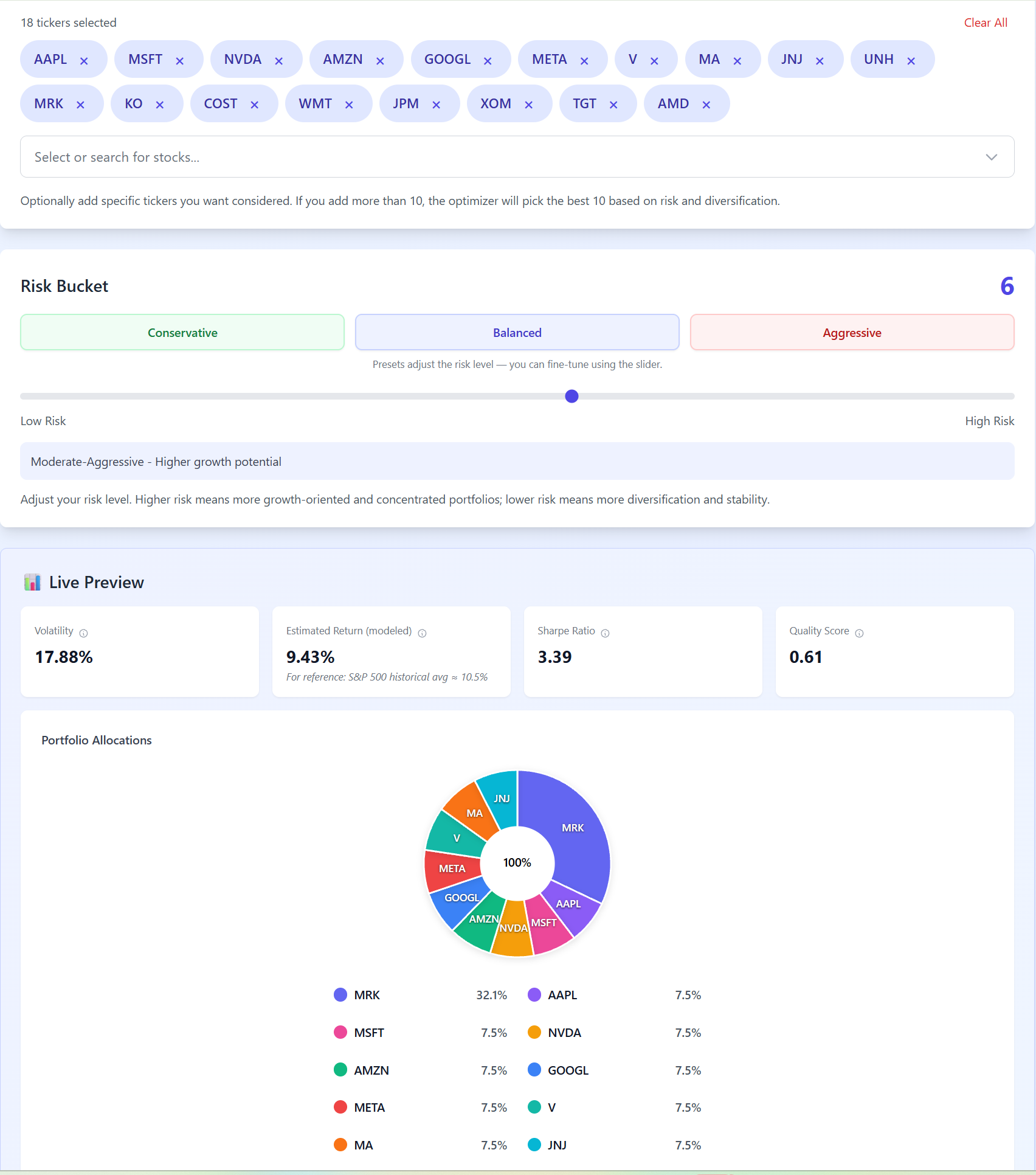
A portfolio optimization web application that helps investors build diversified portfolios by balancing expected return and risk. StockRisker analyzes stocks and ETFs using financial metrics, risk models, and correlation data to generate optimized, constraint-aware portfolios. I designed and built StockRisker end-to-end — from data ingestion and scoring logic to portfolio construction and the user interface. The optimizer balances risk and return using multiple signals, applies real-world constraints, and provides transparent explanations for its results.
TypeScriptReactNext.jsNode.jsFinancial ModelingOptimizationGoogle CloudFirebaseProduct Design